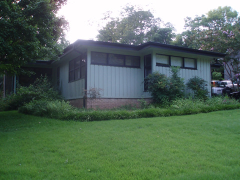
 I love my house. I knew from the moment I first walked in it during our house hunt that I wanted it. It's a mid-century modern house with a fabulous Great Room, in which the kitchen, living room, dining area and a sun room are all part of one large area. It's very welcoming, and I knew it would be a great room for hosting. David loved it, too. But there were two things about the house that he hated - the tremendously overgrown back yard and the mint-green-with-black-trim paint job on the outside. He disliked these two features so much he almost didn't want to buy the place. I convinced him that these were easily fixable, and that cleared the way for us to close the deal.
As soon as we moved in last summer we started hacking away at the mass of bushes and thorny vines that were choking the outside. That basically doubled the size of our yard. It's now under control, and next spring we may even be able to start landscaping and adding plants we actually want.
This month, it's time to fulfill the other condition of our house purchase. Painting!
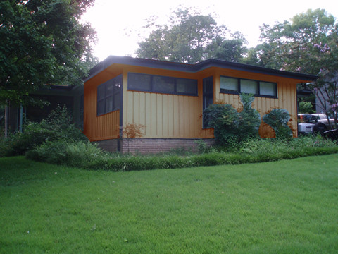
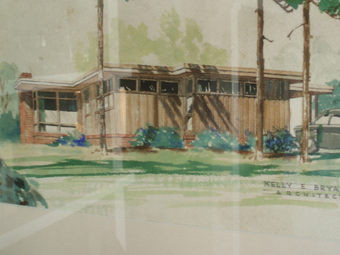 There is a watercolor picture of our house hanging in the sun room. It's the architect's rendition of the house from the 50s, and it shows the outside as a plain but attractive brown - obviously it had just been stained, not painted. David and I really like how our house looks in this picture and cannot understand why the woman who had lived here for 40-some years decided mint green was preferable. From what we can tell in places where the paint is peeling she even had it painted mint green several times over the years. So we are definitely set on going back to some shade of brown, which may be tricky, as we'll have to choose a paint that resembles wood tone because staining just isn't an option anymore.
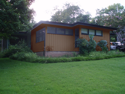
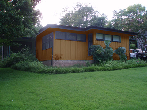
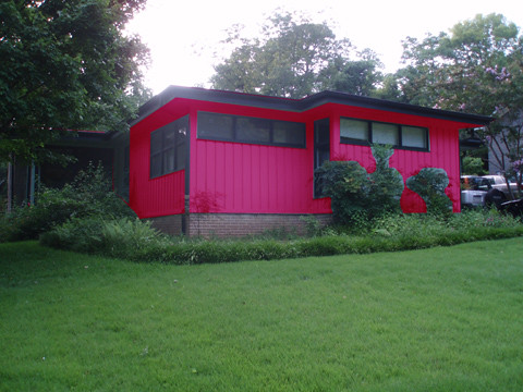
So to help us choose the right color, I turned to Photoshop for help. Here are some possibilities I came up with:
Dark Brown: I don't mind this color, but David thinks it comes off looking cheap.
Cedar: This shade would closely match our wood fence, and currently is our favorite. But is it too matchy-matchy?
Light Cedar: While not our favorite, this color closely resembles the color depicted in the architect's rendition.
We do know we want to go with a dark brown or even black trim. We've researched colors traditionally used on mid-century modern homes, and whenever we found a brown house it had black trim, and we think it looks pretty good - though I don't think it really works on other styles of houses. The other most popular color palette for mid-century moderns involve painting the house white, which is definitely out of the question for us.
This weekend we're going to make a run to Home Depot for some samples, and maybe a few small cans that we can test out on the back of the house. But feel free to cast your vote for your favorite - or tell us these are all awful.
In the end, we may just say forget it - let's just go crazy and really cement our home's reputation as the most garish in the neighborhood.
2 comments:
I like the cedar!
I like the dark brown the best.
Post a Comment